Distant Shores
Shale Cliffs, Hidden Paths, and Storm Clouds.
Distant Shores
On occasion I will make a design that I know is going to be a hard sell.
That was the case with these.
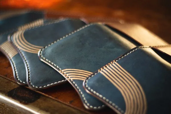
I knew the freehand, not quite perfect lines, were going to look a little wonky. I knew the dip dye marks from the indigo would look strange.
I wasn't seeing all of that while I was making them though.
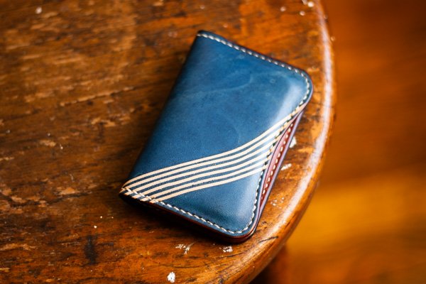
Instead I was looking into the future. I was imagining what those wonky lines would look like as they turned a darker shade of brown. How they would look almost organic after they'd had some time to be bent and curved around the cards inside the wallet. I could see the indigo getting darker, the deepest tones going from new denim to a deeper storm cloud blue. The dip marks taking on a mineral quality. Like marble or slate.
When I started making these I was thinking about perfectionism, mine in particular. I wanted to make something I couldn't possibly do perfectly but might come out beautiful anyway. Something that can only be appreciated over time with attention.
Still. I worried trying to offer someone something that will look cooler in six months or so sounded kind of scammy. So after I'd made them available on the website I pulled one off the shelf, marked it as sold, and got to work proving my point.
Six months worth of wear later and I'm happy to see where it's going. I'm just conditioning my wallet for the first time. The lines are changing. The blue is getting richer.
I see the ultimate goal of this work as being the kind of thing that sneaks up on you. I see my wallets getting fidgeted with while someone is waiting to close out their bar tab, looks down, and notices that the dip marks look like the shore of an ocean. The lines a path running long the coast. Or maybe for a moment they are tree rings recording time's passage.
I like the idea of hijacking someone's imagination, taking them on a little journey to distant shores, while they are waiting to complete some sort of mundane transaction.
A little color in the commonplace.


